Wait A Minute! Legibility Is the Most Important Part Of Watch Design


The watch you see above is the Omega Speedmaster Professional with a lacquered white dial. It has a white dial with black hands and markers and a few pops of red. On top of that, it’s got complications, and those are equally legible. It’s also intuitive because it follows the rules we all know about telling the time and reading a chronograph. The Omega Speedmaster Professional (including the classic black dial) succeeds as a watch. It is a paragon of legibility. But you may be shocked to find out how many watches fail the simple task of being legible. Or perhaps you’re like me and you aren’t surprised so much as frustrated that they exist and gobsmacked that they ever got through the approval process, perfunctory as it may be.

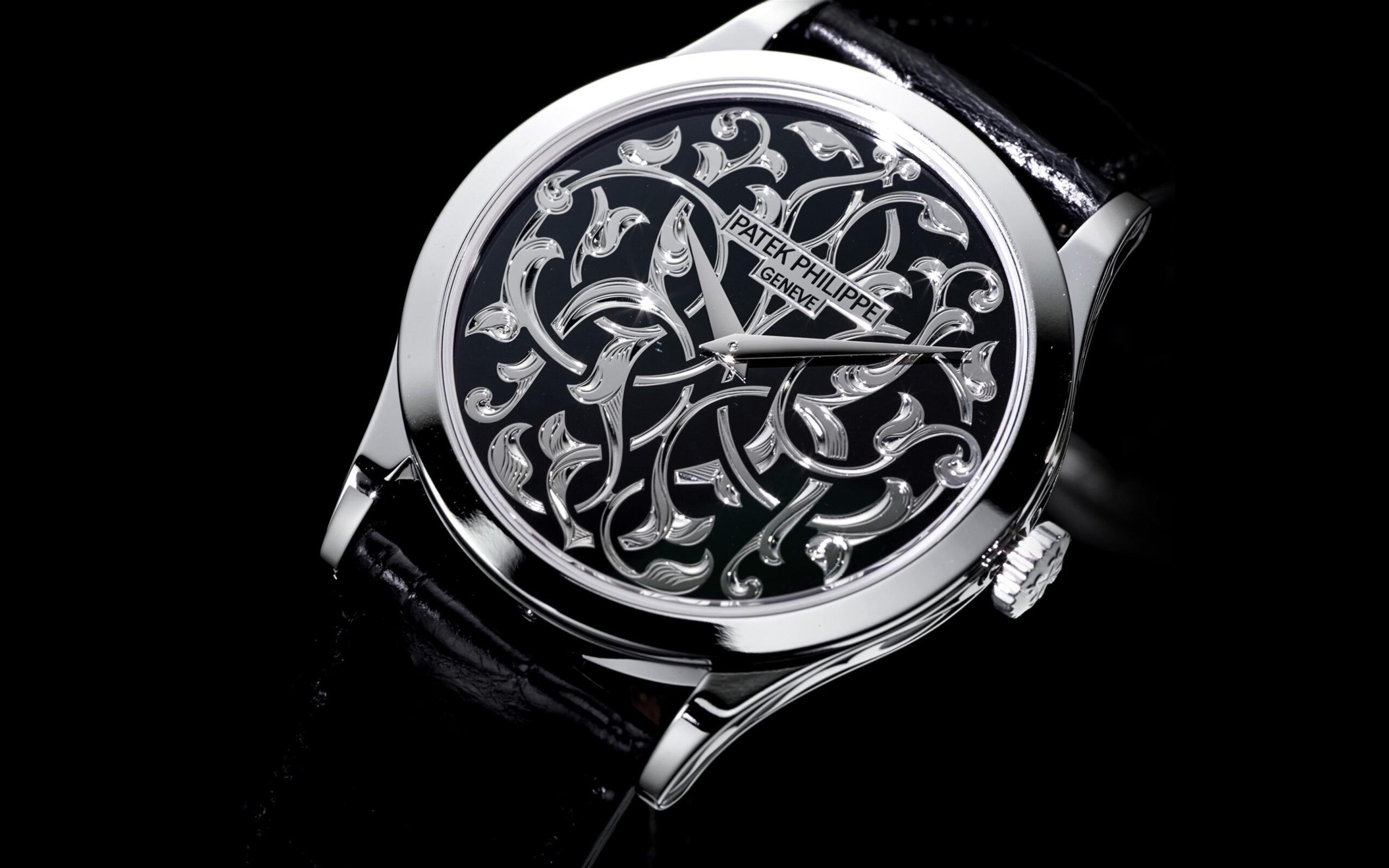 I won’t say that designing a watch is easy. For my part, the mere thought of it terrifies me, so certain am I that I would immediately face decision paralysis at every turn, to say nothing of my utter lack of vision. (I’m not a creator, I’m a critic.) But it baffles me how frequently professionals manage to bungle the fundamental goal of creating a watch that can be used to tell the time. More often than not, these false watches are the result of a brand getting artistic or clever. The watches as art or design are almost always laudable, but they fall short of useful. The watches that always comes to mind first are the Patek Philippe 5750 and 5088 (both seen above). Both feature unique dials and hands that are identically finished, meaning they get lost so easily they may well not be there. (And I’ll say this: never trust a marketing photo; they have been tweaked to death to make it seem like all is well.) But both of those Pateks have other merits. What excuse can be made for the Omega Speedmaster Dark Side of the Moon Black Black (below), a watch so absurdly monotone that it requires the best of lighting luck to be read. Ultimately, the issue is a lack of contrast, and lots of brands, high on their artiness, fail to even bother. Below I present two further examples, one from Czapek and one from is Bulgari.


Good luck.
Open-worked and skeletonized watches more regularly fail the legibility test. The visible movement more often than not complicate reading the watch, and many brand don’t make a good enough effort to create the necessary contrast — that’s what legibility is all about, after all. There are innumerable examples of open-working and skeletonization gone awry, but you know the story, and I don’t think there is a better visual illustration of right and wrong than Hublot. On one hand, we get the blinged out Big Bang Square Bang White Gold High Jewellery with a blur of metal and diamonds and white and metal and diamonds and white. On the other hand we have the Big Bang Unico Green SAXEM, which is black and green, two colors that will not and cannot be confused.

Above: bad. Below: Good.

While we’ve seen that “artistry” and showing off a movement are the most common sources of watches not actually being functional, watch designers and brands seem to find countless ways to ruin their products. Some try to be clever by redesigning how time is displayed. Triangle hands? Peripheral indicators? Floating space objects? An actual counting hand? Get out of my life. I can’t think of a watch that’s cool enough for me to want to actually relearn how to read time. And how have brands not figured out that full lume dials are best paired with solid, not lumed hands? Wrong. Wrong. Right.

Farer gets it.
The irony, of course, is that I kind of love all the watches I’ve used as examples. The Pateks are beautiful, one sonically, the other artistically. The Czapek has a stunning Art Deco dial. The diamond-encrusted Square Bang is so outrageous that I have trouble doing anything but loving it. But I’m still astonished at the number of watches that aren’t capable of their most rudimentary task, and I’m sure I missed a few amazingly awful examples and some ways in which brands manage to mess things up. Just because a watch does something unique or admirable or innovative doesn’t make it a good watch. If I can’t read it, I don’t want it.
(I guess I don’t love all the watches I mentioned: The Bulgari sucks.)


![Hands-On: Ulysse Nardin Diver [Air] Watch](https://som2nypost.com/wp-content/uploads/2025/04/Ulysse-Nardin-Diver-Air-RHE-Featured-336x220.jpg)